
Reports
The Report Designer allows you to create new reports, bind them to data, and even pass them to another workstation and load them into another instance of the Report Designer. In addition to report editing capabilities, it allows you to display its Print Preview and send its output to a printer or export it to a file on disk.
Click the area of the window you want to learn more about.

The menu bar displays below the title bar. Click the following menus to learn about the available commands.
Save – Saves the changes to file.
Exit – Closes the Report Designer.
Undo – Undo the last operation.
Redo – Redo the last operation.
Cut – Removes the selection and places it on the Clipboard.
Copy – Copies the selection to the Clipboard.
Paste – Inserts the contents of the Clipboard at the insertion point.
Delete – Deletes the selection.
Select All – Selects all items.
Designer– Changes the page layout to one of the following:
Preview–Views the report in Print Preview mode. You will be prompted to enter report parameters.
HTML View– Views the report in HTML. You will be prompted to enter report parameters.
Toolbars– Shows or hides the toolbars. Also allows for customizing the toolbar and menu bar.
Windows– Shows or hides portions of the window.
Foreground Color– Specifies the text color for the control.
Background Color– Specifies the background color for the control.
Font– Specifies the font settings for the control.
Justify– Allows you to change the alignment of the control's text.
Align– Allows you to change the alignment of the control's text.
Make Same Size– Allows you to choose the control size.
Horizontal Spacing– Allows you to choose the horizontal spacing.
Vertical Spacing– Allows you to choose the vertical spacing.
Center in Form– Centers the control in the form horizontally or vertically.
Order– Brings the selected controls to the front or moves the selected controls to the back.
The Report Designer contains the following toolbars.
If one of the toolbars are hidden, you can enable it by selecting View | Toolbars on the menu bar.
The Main Toolbar contains buttons which provide the capability to save report layouts, cut, copy and paste report elements, and undo-redo actions in the Report Designer.

The Formatting Toolbar allows you to easily customize an element's font, color and alignment settings.

The Layout Toolbar allows you to easily align report elements to one another, change their size to match one another and customize spacing and z-order.

The Zoom Toolbar allows you to zoom a report in and out, providing easier control over report's layout.

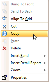
The Context Menu can be invoked by right-clicking a report or its elements. This menu provides quick access to frequently used commands such as zooming, clipboard operations, inserting bands and invoking the Property Grid, etc. The available action set varies, depending on the element where you invoked the context menu.
The Tool Box lists all available controls and allows you to add them to your report.
If the Tool Box panel is hidden, you can show it by selecting View | Windows | Tool Box on the menu bar.
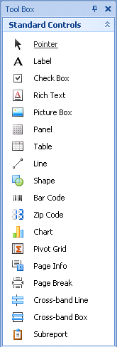
To add a control from the Tool Box, do one of the following:
Double-click an item in the Tool Box for the appropriate control, which will be created at the Detail band's top left corner.
Drag and drop an item from the Tool Box onto the required location within a report.
Select an item in the Tool Box, and then click the required location within a report.
Select an item in the Tool Box, and then indicate the bounding rectangle by holding the left mouse button.
Select the Pointer item when you need to perform selection, re-positioning or resizing operations. It is automatically selected after you drop a control onto a report.
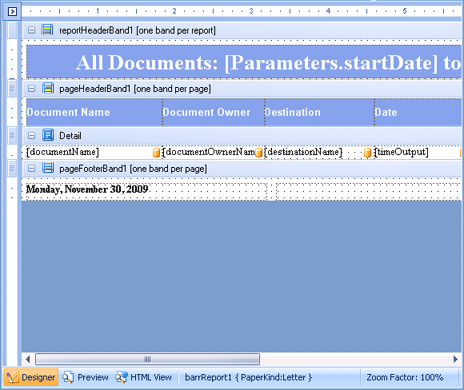
The Design Panel provides the following three tabs (switched at the bottom).
Designer tab - Allows you to customize a report, manage its bands and controls, and define their properties.
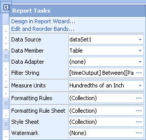
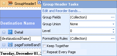
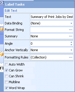
Smart tags - From the Designer tab, you can use smart tags. Most report elements have smart tags that provide easy access to the most frequently used settings. Clicking an element's smart tag invokes a pop-up window with action links and editors, allowing you to customize this element.
A report's smart tag icon is located at the top left corner of the Design Panel. Note that you need to click that corner twice. The first click selects the report object, allowing you to change its settings in the Property Grid. The second click invokes the smart tag's pop-up window.
A band's smart tag icon is located on the band strip right next to its caption. For instance, the smart tag for the Group Header band is shown in the following image.
A control's smart tag icon is located at the top right corner of the control. For instance, the smart tag for the Label control is shown in the following image.
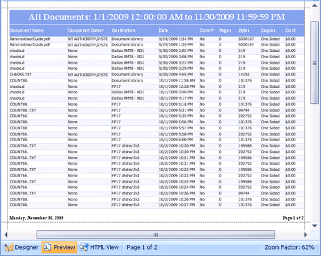
Preview tab - Shows a print preview, and enables you to print out your report or export it to a file on disk.
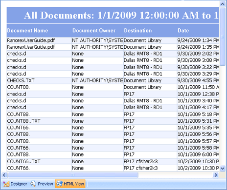
HTML View tab - Shows the report output in HTML format.
If the Group and Sort panel is hidden, you can show it by selecting View | Windows | Group and Sort on the menu bar.

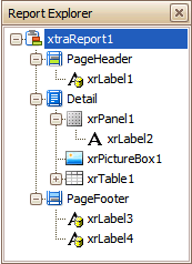
The Report Explorer shows a report's structure in a tree form, providing easy access to report elements. Once an element has been selected in the Report Explorer, it's settings can be changed using the Property Grid window.
If the Report Explorer is hidden you can make it visible it by selecting View | Windows | Report Explorer on the menu bar.
The Report Explorer contains two tabs, Report Explorer tab and Field List tab.
The Report Explorer shows a report's structure in a tree form, providing easy access to report elements. Once an element has been selected in the Report Explorer, it's settings can be changed using the Property Grid window.
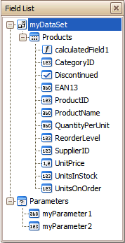
The Field List window serves the following purposes.
Displays the list of all available data fields (attributes you can show in your report) and allows you to create report elements that will show information from these fields.
Allows you to create calculated fields by building expressions based on the values of data fields, report parameter values, etc.
Shows existing report parameters, and allows you to add parameters to your report.
The Property Grid allows you to change the settings of the currently selected report element. See the Report settings topic for a description of each property.
If the Property Grid is hidden, you can enable it by selecting View | Windows | Property Grid on the menu bar.
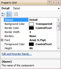
To select an element and show its properties within the Property Grid, do one of the following.
Click the required element on the Report Designer surface.
Select an element using the Report Explorer window.
Select an element from the Property Grid's combo box.