Reports
under construction
A Report control is an element showing information in your report (e.g. static or bound text, line, picture, check box, etc.).
The following controls are available in the designer's Toolbox panel.
Pointer – Select the Pointer control when you need to perform selection, re-positioning or resizing operations. It is automatically selected after you drop a control onto a report.
Label – The Label control is intended to display textual information in a report. For example, the Label may be used to show static text, as well as data from the bound data source. In addition, you can use it to calculate a summary function for the specified data field, or to extend its usual functionality by writing scripts for the available events.
After a Label is added to a report, you can customize its text, appearance and other properties, which can be accessed in the Property Grid panel. Frequently used properties are also available via a control's Smart Tag and Formatting Toolbar, which makes it easy to perform common operations.
Check Box – The Check Box control is intended to display a True/False or Checked/Unchecked/Indeterminate states in a report, by displaying a check mark and adjacent text.
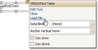
Rich Text – The Rich Text control allows you to display, enter, and manipulate formatted text.
The control has a functionality similar to the Label control, but can also apply formatting to any part of the text. The formatting options include font face, font styles and sizes, font color.
Rich text files (RTF) can be loaded to this control via its Smart Tag.
Picture Box – The Picture Box control is intended to display images in a report. Typically, an image is loaded from an image file, or from the bound data source. In addition, an image can be loaded from a web location using the specified URL. The following image formats are supported by the Picture Box control: BMP, GIF, JPEG, PNG, TIFF, EMF and WMF.
Panel – The Panel control is intended to group individual report controls.
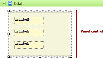
The Panel control is a container to keep together any number of report controls. When the controls are placed onto a Panel, they can be moved, copied and printed as a whole. There are currently several limitations on Panel usage. One of them is that the Panel control does not have the Can Shrink property, and so cannot suppress the white space that appears when the controls inside are shrunk or collapsed. Also, the Panel cannot be used in different bands, unlike a cross-band control.
The Panel can be used for page decoration - to create borders around the report elements or add a uniform color background.
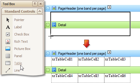
Table – The Table control is designed to arrange the report information in a tabular layout.
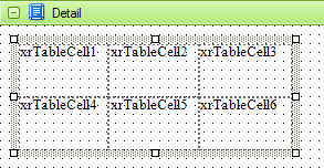
When the Table control is dropped onto a report's band from the Toolbox, it becomes a table of one row and three columns. If you click and drag over several bands, the resulting table will be split by the bands into several tables. This creates a table header in the header band and the table's body, with one mouse move.
The Table control bound to data is created automatically when you drag and drop a data table from the Field List window.
You can manage a table's elements by using its Context Menu.
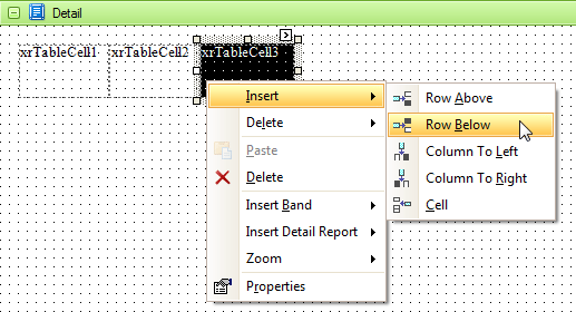
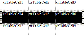
The Table control consists of the Table Row controls, each representing one table row. The Table Row, in turn, consists of Table Cell controls, each representing one table cell. They can be selected and customized individually (see the appropriate topics).
To select the Table control in the Report Designer, use the Report Explorer or the drop-down selector of the Property Grid.
Table Row – The Table Row Control represents a single row within a Table.
This control is useful for changing the layout of the entire row. Although in this document, a Row is described as a separate control, in fact most of its properties are actually applied to the Cells contained within the selected row.
Table Cell – The Table Cell control represents an individual cell within a Table.
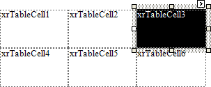
In general, the Table Cell control's properties are similar to the properties of the Label control.
Line – The Line control represents a line used for decoration and visual separation of a report's sections.
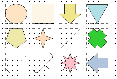
Shape – The Shape control is typically used for embedding simple graphics into a report.
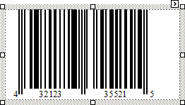
Bar Code – The Bar Code control inserts a bar code into a report.
 The barcode quality can degrade when the
report is exported to formats other than PDF. To ensure reliable barcode
recognition, print the report directly from an application using the native
printing methods. The Module and Auto-Module properties
of a control should be used with care.
The barcode quality can degrade when the
report is exported to formats other than PDF. To ensure reliable barcode
recognition, print the report directly from an application using the native
printing methods. The Module and Auto-Module properties
of a control should be used with care.
Zip Code – The Zip Code control displays a zip code in a report.
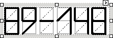
Chart – The Chart control is used for data visualization in reports. It graphically represents a series of points using 2D or 3D chart types. More information about this control can be found at the Charting document.
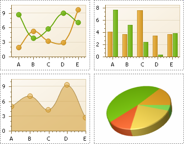
There are many built-in Chart view types you can choose from, such as Bar, Point, Line, Pie and Doughnut, Area, Radar and Polar, Range Bar, Gantt, Candle Stick and Stock.
A Chart control contains multiple elements (diagram, series, series points, axes, legend, titles, labels, strips, constant lines, etc.). When any of these elements is selected, the Property Grid shows only the properties which correspond to the selected item. Visual Chart elements which can be highlighted or selected, are described in Select Chart Elements.
The Chart control is data-aware in a different manner than the other report controls. Consider three common report scenarios:
Static data for a Chart's series is provided manually. It can be done using the Series Collection Editor invoked by the Chart's Series property. It allows you to manually define values and arguments for each series point.
Chart's series are created automatically, getting their data from the Chart's Data Source and dependent on the rules defined by the Series Template property. This approach is described in Chart with Dynamic Series.
Each series is created and customized manually and has a separate Data Source. This approach is described in Chart with Static Series.
You can customize a created chart using both the Property Grid and the Chart Wizard. To invoke the Chart Wizard, click a Chart's Smart Tag, and in the invoked actions list, click the Run Wizard link.
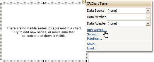
Then, the Chart Wizard will guide you through the whole process of customizing the Chart, from defining its view type to providing its data and customizing its appearance.
Pivot Grid – The Pivot Grid control represents data from an underlying data source in a cross-tabulated form to create cross-tab reports. It calculates summaries and summary totals against specific fields, and displays the summary values within data cells.
There is a designer allowing you to easily customize the Pivot Grid. It can be invoked using the control's Smart Tag.
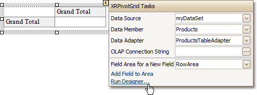
The Pivot Grid displays data in a manner similar to Pivot Tables in Microsoft Excel. Column headers display unique values from one data field, say, car models. Row headers display unique values from another field, say, dates. Each cell displays a summary for the corresponding row and column values. By specifying different data fields, you can see the total number of cars sold on a particular date, or the total number of deals, etc. This way, you get a really compact layout for data analysis.
A tutorial on how to use the Pivot Grid control can be found at Cross-Tab Report.
Page Info – The Page Info control is intended to insert page numbers, current date and time, and the name of the current user into a report.
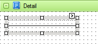
Page Break – The Page Break control is intended to insert a page delimiter, which can be placed at any point within a report.
This control is visually represented by a short line, attached to the left side of the Design Panel, as shown in the image below.
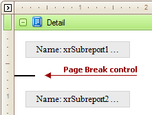
The Page Break control is useful when you need to insert a page break between controls within a band - for example, to divide subreports, so that the second subreport starts printing on a new page.
Cross-band Line – The specifics of the Cross-band Line control is that it allows you to draw a line through several bands.
This can be useful if it is required to visually emphasize a section transcending multiple band areas by a line. In other aspects, this control is similar to the Line control.
The Report Designer supports one more cross-band control - Cross-band Box.
Cross-band Box – The Cross-band Box control allows you to draw a rectangle through several bands.
This can be useful if it is required to visually emphasize a section transcending multiple band areas with a rectangle.
The Report Designer supports one more cross-band control - Cross-band Line.
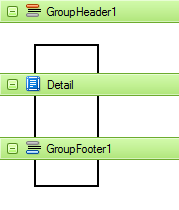
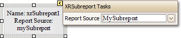
Subreport – The Subreport control allows you to include other reports into a current report.
There are several reasons for using subreports. The first is to reuse reports. This can be practical if there is a particular report structure that has to be included in all reports, and the report must have a consistent appearance and functionality. A good example is a report header that contains the company information, the logo, the date etc. The second reason for using subreports is a creation of master-detail reports (reports with hierarchically linked data).

Use one of the following methods to add controls to a report.
To create a control, drag it from the Toolbox panel onto the report's area.
To automatically create a control bound to data, drag a field from the Field List panel, and drop it onto a report's surface. When dropping a field onto an existing control, this control will be bound to the data field.
If you drag the field with the right mouse button, when the button is released the context menu is invoked. Use this menu to specify which control should be created.
To learn more about data binding for report controls, see Display Values from a Database (Bind Report Elements to Data).
When the controls overlap, the report may
be shown incorrectly when exported to HTML, XLS or RTF formats. Red signs
and a report's tooltip indicate this situation. You may switch off the
red warning marks via the report's Show Export Warnings property.
To change a control's size and position you can use the following key combinations:
|
Key Combination |
Action |
|
ARROW keys |
Snaps the control to the grid and moves it up, down, left or right by one grid step, defined by a report's Grid Size property. |
|
CTRL + ARROW |
Moves the control up, down, left or right by one report unit. |
|
SHIFT + ARROW |
Increases or decreases the control's width or height by one grid step, defined by a report's Grid Size property. |
|
CTRL + SHIFT + ARROW |
Increases or decreases the control's width or height by one report unit. |
|
TAB |
Selects the next control in tab order. |
|
SHIFT + TAB |
Selects the previous control in tab order. |